Redesigning an AI-powered test generation platform from confusing forms to a fast, intuitive workflow.
Role
Product Designer
Timeline
2 Months
Platform
SaaS Web Application
Deliverables
Research, User Flows, High-fidelity screens
Domain
QA Automation /AI Testing

Key metrics

80%
Faster Time to First Test
67%
Reduction in UX Support Tickets
+40pts
Onboarding Completion Rate
What is Orange Pro ?
OrangePro is an AI-powered QA platform that helps engineering and QA teams generate comprehensive test cases from user stories and automatically analyze production incidents to prevent recurrence.
Product Type
AI-Powered QA Testing Platform for SaaS, E-commerce & Logistics companies
Core Features
Requirement-Based Test Generation & Incident-Based Defect Analysis
Target Users
QA Engineers, DevOps Teams, Product Managers at growth-stage companies
Tech Stack Context
Integrates with Jira, TestRail, GitHub, and Confluence for seamless workflows

Heuristic UX Audit (The Roast)
Conducted a thorough heuristic evaluation of both core product screens the Requirement Test Generator and the Defect Analysis screen. Applied Nielsen's 10 usability heuristics and documented critical UX failures across the two screens. Prioritized findings by severity: critical blockers vs. moderate friction vs. minor polish issues.

No Auto-Fetch Intelligence
The system made users do manual work. Auto-fetch wasn't being utilized where it could eliminate friction entirely.

Zero Quick Start
No sample data buttonNo templates No pre-filled examples. High barrier for new users who needed immediate value.

Mandatory Application
It Requires a full application description before generating any tests a significant friction point in the critical first-use moment.


Confusing Tabs
Manual vs Jira toggled as separate tabs unclear what the functional difference was or whether both could be used together.

URL Copy-Paste Hell
Required manually hunting down and pasting 3 separate URLs (Jira, TestRail, Confluence) tedious busywork despite having integrations available.

Hidden Value Proposition
Required manually hunting down and pasting 3 separate URLs (Jira, TestRail, Confluence) tedious busywork despite having integrations available.


The Core Issues
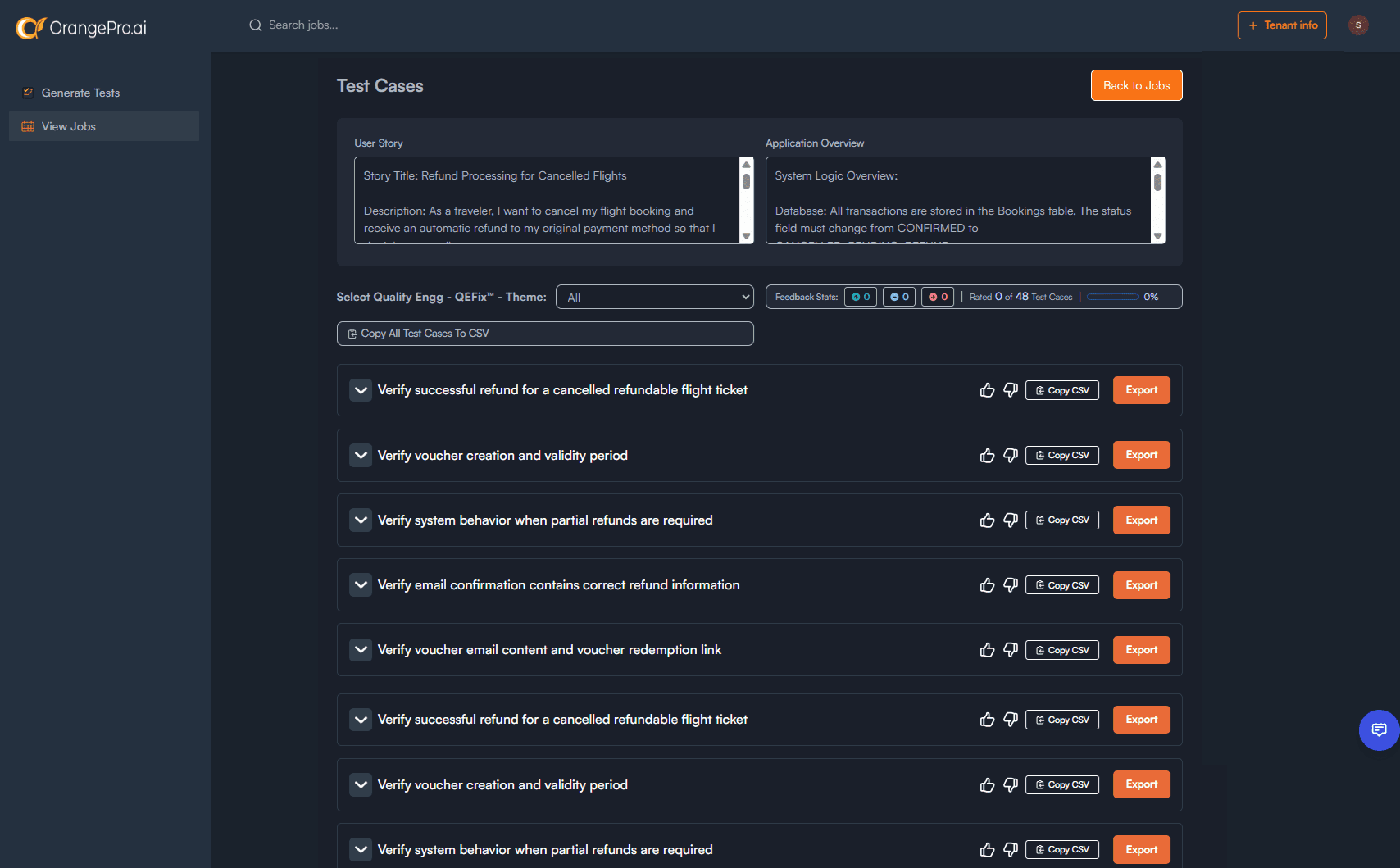
OrangePro's AI could generate 48 comprehensive test cases in seconds,but the product interface was so friction-heavy that users couldn't get there. The onboarding presented blank text boxes with no guidance, separate navigation paths created confusion, and the results screen hid 90% of generated tests behind dropdowns and pagination. The AI's value was being completely buried by poor UX.
Competitive Analysis
Benchmarked OrangePro against 6 competing or analogous tools in the QA and testing space: Testsigma, Katalon, Autify, Mabl, BrowserStack, and Postman. For each, identified the single UX pattern they executed best and extracted the underlying design principle for OrangePro to borrow.
Understanding the Landscape
Before designing solutions, I conducted a thorough competitive analysis of leading QA and testing tools to identify industry-proven UX patterns.
Competitor
Key Feature Studied
What They Do Right
Key Pattern Borrowed
Testsigma
Natural Language Test Generation
Plain-language prompts instantly create test cases near-zero learning curve
Low-friction Entry
Katalon Studio
Record & Playback Onboarding
Users can observe, import or replay tests visually before writing anything manually
Visual learning Path
Autify Nexus
Quick Start Templates
Pre-built scenario workflows for common usecases users get value on minute one
Immediate value
Mabl
Auto-Import from Jira
One-click sync that eliminates all manual URL pasting integrations actually used
Reduced Friction
BrowserStack
Try Demo Before Signup
Sample app + real data lets users experience output before any commitment
Risk-free trial
User Flow Architecture
Designed comprehensive user flow diagrams covering two major journeys: the onboarding flow (first-time vs.
returning users, 3-step wizard) and the full test generation flow. Each flow documented decision points, happy
paths, edge cases, error states, and recovery mechanisms. Defined 3 input paths for test generation: Quick
Start, Template Library, and Jira/GitHub import.
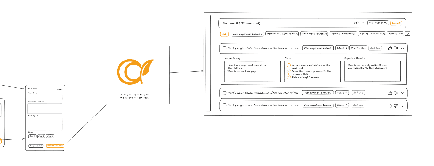
01. Entry & Auth
Landing page to Social Signup/Login (Google/GitHub). Existing users skip straight to the dashboard.
02. Onboarding
New users get a guided tool connection wizard (Jira, Testrail, Confluence) with a skip option. Returning users go straight to the dashboard.
03. Path A (Templates)
Select from 3 industry templates (SaaS, E-Commerce, Logistics) to generate a test suite in under 2 minutes.
04. Path B (File Upload)
Upload a PRD, user story, or spec file. AI extracts context and populates fields for user review and generation.
05. Path C (Jira Import)
Search and select Jira tickets or import Confluence pages to auto-populate requirements.
06. Defect Analysis
Auto-fetches or manually inputs recent incidents to analyze and generate targeted regression tests with insights.
07. Preview & Refine
Review test cases in preview mode. Inline edit steps, add/remove/regenerate cases, and track changes.
08. Export
Edit, save draft, or export tests (CSV, Excel, Testrail, Confluence). Primary CTAs are clearly emphasized.

Wireframing (Both Screens)
Created detailed wireframes for the redesigned Test Generator and Defect Analysis screens. Incorporated
progressive disclosure principles (collapsible advanced options), Quick Start prominently surfaced, import
source cards replacing URL text fields, and auto-fetch indicators for connected integrations. All wireframes
annotated with design reasoning.


Design Decisions
The Hard Calls
Quick Start as the Default Entry Point
Should users be asked to fill in requirements first, or should the path to value be Quick Start
with sample data?
Onboarding Design
Option A: Form-First
Present the input form immediately. Power users who know what they're doing can start right away.
Quick Start Prominent Chosen
Surface "Try with Sample Data" Full form available but secondary foldable by default for new users.
Why this decision: Competitive research revealed that every top-performing tool in this space defaults to a demo-first experience. Users need to see output before investing effort in input. The Quick Start reduces the emotional risk of the first session. Power users can ignore it but new users won't get stuck at a blank canvas.
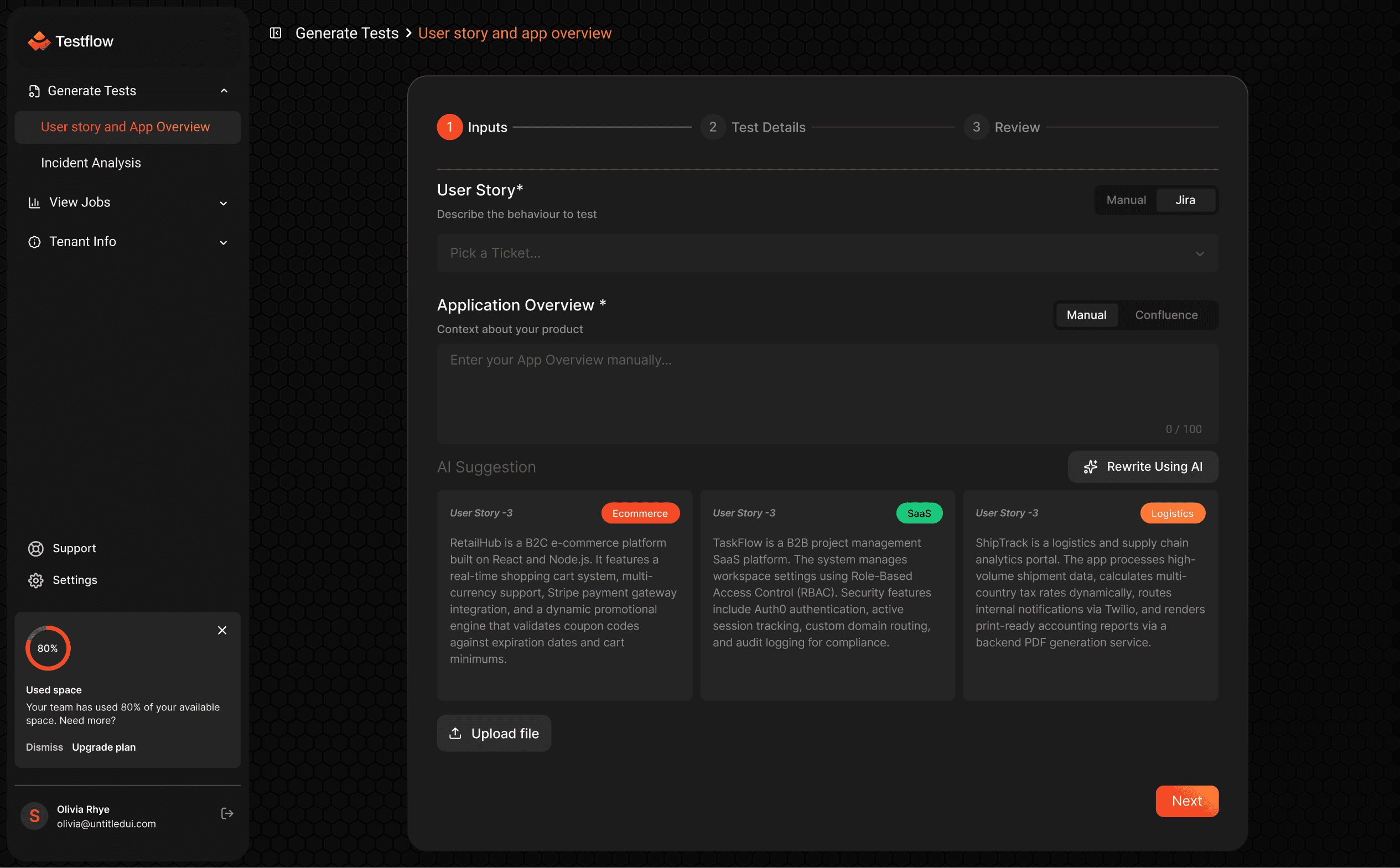
Application Overview *
Context about your product
Manual
Confluence
Enter your App Overview manually...
0 / 100
AI Suggestion
Rewrite Using AI
User Story -1
A B2C e-commerce platform built on React and Node.js. It features a real-time shopping cart system, multi-currency support, Stripe payment gateway integration, and a dynamic promotional engine that validates coupon codes against expiration dates and cart minimums.
User Story -2
A B2B project management SaaS platform. The system manages workspace settings using Role-Based Access Control (RBAC). Security features include Auth0 authentication, active session tracking, custom domain routing, and audit logging for compliance.
User Story -3
Logistics
A logistics and supply chain analytics portal. The app processes high-volume shipment data, calculates multi-country tax rates dynamically, routes internal notifications via Twilio, and renders print-ready accounting reports via a backend PDF generation service.
Upload file
Results as Table View (Not Accordion)
The current design collapsed test cases inside a theme dropdown. How should 48 generated tests
actually be displayed?
Onboarding Design
Option A: Grouped Accordion (Current)
Tests hidden inside expandable theme sections. Keeps screen clean but buries the AI's output, users can't scan all tests quickly.
Table View Default Chosen
Compact table showing all tests at once with theme pills as filters. Card view toggle available for detail inspection.
Why this decision: The AI generated 48 tests but the dropdown + pagination combo made ~42 of them invisible.
This actively undermined the product's core value proposition. A compact table view shows everything at once,
allows bulk export, and lets users appreciate the breadth of AI output. Card view is preserved as a toggle for users
who want detail-focused inspection.
Test No :22
View User Story
Total Use cases
48
Success Rate
28
Failure Rate
20
Success Rate: 68%
Failure Rate: 22%
Transaction Failures (7)
Data Integrity and Accuracy (4)
User Experience Issues (7)
Performance Degradation (9)
Integration Failures (9)
Security Misconfigurations (9)
Data Loss (9)
Configuration Errors (9)
Service Downtime (9)
Concurrency Issues (9)
Title
Status
Copy
Status
Export
Verify Successful refund for a cancelled refundable flight ticket
Copy CSV
Success
Export CSV
Verify Successful refund for a cancelled refundable flight ticket
Copy CSV
Success
Export CSV
Verify Successful refund for a cancelled refundable flight ticket
Copy CSV
Success
Export CSV
Verify Successful refund for a cancelled refundable flight ticket
Copy CSV
Success
Export CSV
Verify Successful refund for a cancelled refundable flight ticket
Copy CSV
Success
Export CSV
Verify Successful refund for a cancelled refundable flight ticket
Copy CSV
Success
Export CSV
Export Selected
1
2
3
4
5
Designed graceful handling for the 6 most common failure scenarios — ensuring users are never stuck,
never lose work, and always have a clear recovery path.
What Was Redesigned
Six interconnected solutions addressing the root causes, not just the surface
symptoms.
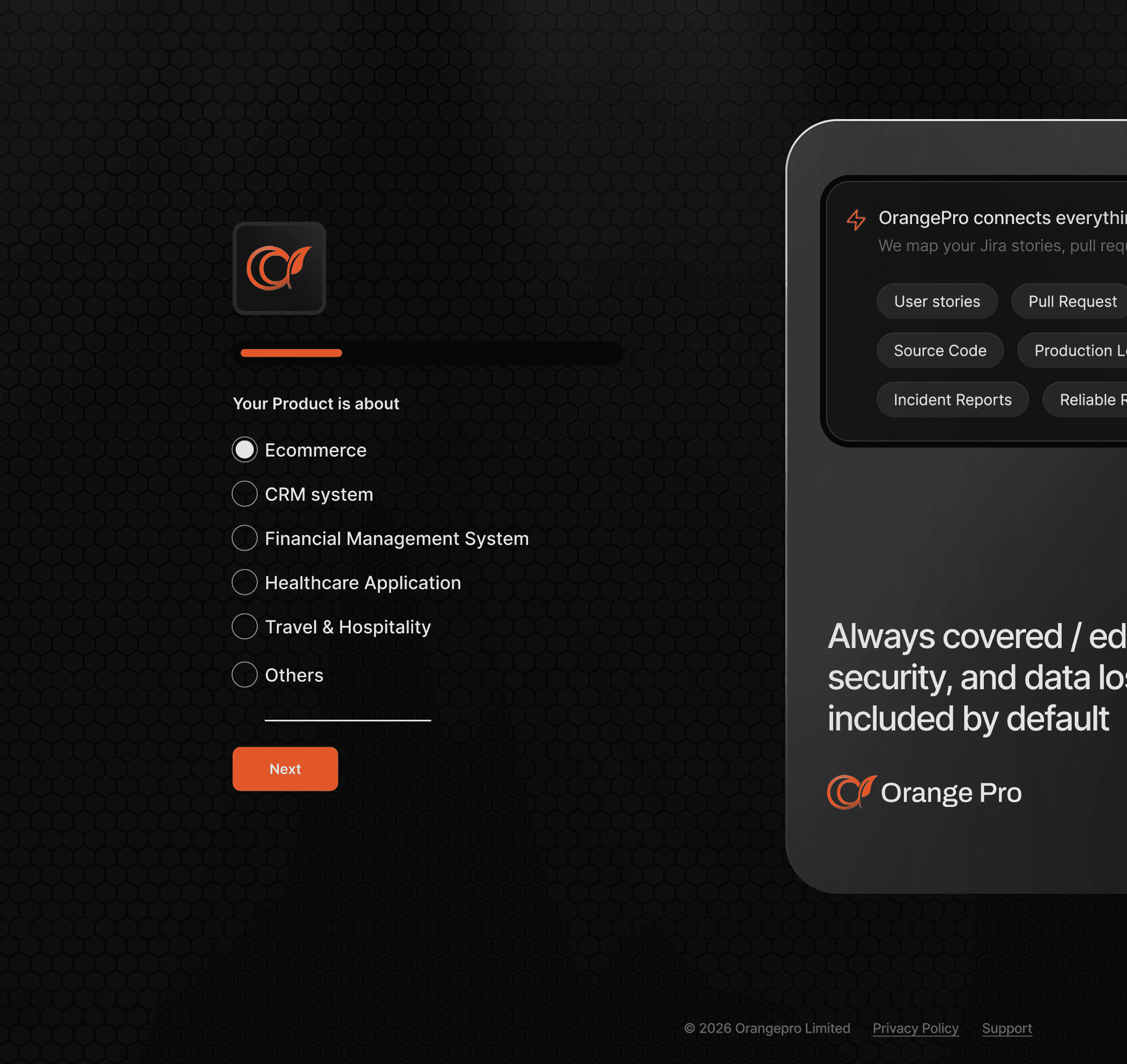
Progressive Onboarding Wizard
Replaced the cold-start experience with a 3-step onboarding wizard for first-time users. Each step has a
single clear action with a skip option, eliminating the blank canvas paralysis that was killing activation.


Unified Screen with Mode Toggle
Redesigned the Defect Analysis flow to eliminate URL copy-paste entirely. Connected tools are
displayed as visual source cards. Auto-fetch pulls incident data on selection. Manual entry exists as a
fallback, not a default.

What I Learned
Time to Value is Everything
In a B2B SaaS product, the most critical metric isn't retention, it's time to first value. Every design decision was evaluated through the lens of "does this make the AI's output visible faster?" Everything else was secondary.
Competitors Are Free Research
Six hours of competitive analysis yielded patterns that would have taken weeks of user testing to surface
independently. Testsigma's NLP approach and Postman's mode toggle were direct inspirations that saved significant design iteration cycles.
Results Screens Are Underrated
The test results screen was the most impactful redesign not because it was the flashiest, but because it was where the AI's value actually landed. Hiding 90% of output behind a dropdown was actively destroying product credibility.
Error States Are Features
Designing the 6 edge cases and error states wasn't an afterthought it revealed that most of OrangePro's UX problems were fundamentally about what happened when things went wrong. Graceful degradation is a core product experience.
The biggest insight: OrangePro didn't need a better AI,It needed a better front door. The technology was sound. The experience of getting to the technology was the product.