
Enterprise Security UX Redesign
In enterprise environments, employees often handle highly confidential client files and internal databases. Despite compliance training and strict policies, human error remains the biggest cause of data leaks. Anzenna is a Security SaaS platform designed for large organizations to monitor and manage internal data security risks.


Our design challenge became:
“How might we simplify data-heavy information into a structured, intuitive, and visually cohesive interface that builds confidence rather than confusion?”


Dashboard
Problem
The previous dashboard design presented a dense, fragmented view of data across multiple widgets, graphs, and metrics without a clear hierarchy. Key information like “Company Risk Score,” “High-Risk Employees,” and “Top Incidents” competed for attention, making it difficult for users to quickly assess overall security health. Visual clutter, inconsistent spacing, and lack of contextual grouping further increased cognitive load, forcing users to manually interpret relationships between metrics.
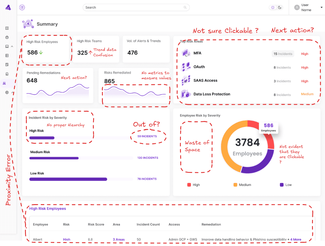
Problem
Through heatmap analysis and user session recordings, we identified which dashboard elements drew attention and which were ignored. we Conducted heuristic analysis of the existing dashboard to identify navigation and clutter issues.

Mapped key user journeys for Security Admins to streamline data-to-action workflows.

Sketched and tested low-fidelity wireframes with internal stakeholders to validate information hierarchy.


We tested multiple layout variations and validated them with security teams across weekly sprints.


faster navigation to Report Generation
Clear prioritization of threats
Shift from “What am I seeing?” to “What must I do next?”
Risk Score
Problem
Admins didn’t trust the risk scores because the logic behind them was opaque. They couldn’t see which behaviors contributed to a score of 87, or if it even indicated a real violation. Some employees had legitimate exceptions that the system still flagged as risky, making it unreliable.
Approach
We interviewed security analysts to understand how they interpret risk and what “trust” in a system means for them. We realized context and control were the missing elements.
Solution
Added hover-to-reveal tooltips explaining how each risk score was calculated.
Introduced adjustable sliders so admins could tweak the weighting of parameters (e.g., file-sharing, external uploads).

Transparency improved platform trust and adoption.
Customize risk models for their departments without developer help.
Improved accuracy and reduced confusion during audits.
Filters
Problem
Filtering data was a nightmare. A dropdown for “Departments” contained 100+ unsorted entries. Finding “Engineering” and “Analytics” meant endless scrolling. Excluding specific departments wasn’t even possible.
Approach
We studied how security admins created reports and noticed a pattern: they needed targeted but flexible filtering — often inclusion and exclusion in one query.
Solution
Added search within filters for instant lookup.
Introduced an exclusion toggle, enabling advanced logic like:
“Show all high-risk employees except those in Finance and HR.”Grouped departments alphabetically and by hierarchy.

Admins praised the flexibility and simplicity
Reduced cognitive load during audits and incident reviews
Training Workflow
Problem
After identifying a high-risk employee, admins hit a dead end. The only option was a vague “Notify User” button with no clarity about what happened next. The platform felt like a monitoring tool, not a remediation tool.
Approach
We collaborated with developers to integrate Slack APIs, allowing direct communication with employees who triggered a risk alert.
Solution
We designed a Phishing Campaign Dashboard that displayed key metrics such as completion rate, success rate, and user performance for each campaign. To ensure users weren’t just passively watching training videos, we introduced post-video verification tests, short, relevant questions to confirm genuine understanding. The dashboard also allowed admins to monitor test results, track progress over time, and identify departments or users needing retraining.

Behavioral improvement became measurable
Reinforced a culture of accountability and learning
Transformed a passive alert system into an active education platform
UI Consistency
Problem
A visual audit revealed: Inconsistent typography and spacing Mixed icon styles Duplicate components with slight variations Poor color contrast for data visualizations
Approach
Anzenna used Ant Design as a base, but teams had added many ad-hoc elements. We conducted a component inventory, identified off-pattern elements, and redesigned them.
Solution
Created a unified design system based on (but improved from) Ant Design.
Defined a new typography hierarchy, component library, and color logic based on severity levels (Safe → Caution → Risk → Breach).
Established reusable Figma tokens for scale.

Design-to-dev handoff became seamless.
Visual consistency improved user focus and trust.
Reduced UI bugs and redundant code.
AI Chatbot
Problem
Finding specific data required navigating multiple dashboards and filters. Admins wasted minutes just to answer simple questions.
Solution
We prototyped an AI-powered chatbot that acts as a conversational query engine.
Admins can type:
“Show me all high-risk employees in Engineering who haven’t completed training.”
The system instantly surfaces results across multiple modules.


Reduced navigation time by 80%
Increased adoption of platform features
Provided multi-layered insights in seconds
Conclusion
While these are a few key scenarios, our work at Anzenna went far beyond individual screens.
We conducted weekly audits, iterated relentlessly, and collaborated deeply with engineering and compliance teams.
Anzenna was my first deep SaaS UX experience, shaping how I now think about:
Data visualization as storytelling
Trust as a UX outcome
Design systems as the foundation of scalability
By redesigning Anzenna with empathy and structure, we turned a confusing system into a powerful command center, one that empowers security teams to act decisively, educate effectively, and protect organizations confidently.


I believe in human taste and decision over the generated one. If your product feel the generic and you need a designer to fix it.
- let's talk.
Copy component
Copied
santhoshlenin131@gmail.com
Copy component
Copied
santhosham.me


